uberAgent in the Helpdesk Pt. 3 – The Score Dashboards
Welcome back to our practical blog post series, where we’re learning more about using the uberAgent products in helpdesk scenarios. In today’s blog post, we’ll focus on uberAgent UXM’s user, machine, and application score dashboards.
We recommend reading the articles in this series in the following order:
- uberAgent in the Helpdesk Pt. 1 – The Helpdesk app
- uberAgent in the Helpdesk Pt. 2 – The Experience Score Overview
- uberAgent in the Helpdesk Pt. 3 – The Score Dashboards (this article)
- uberAgent in the Helpdesk Pt. 4 – The Security Score
Detailed Overview
You might ask yourself how the two words from the chapter headline, detailed and overview, fit together. In the last article, we learned what the Experience Score Overview is and what you can do with it. We found that an overview is important but could benefit from an additional layer of details.
We’ve created three dashboards that are very similar to our Experience Score Overview but add a heap of contextual information to cover more specific use cases: User Scores, Application Scores, and Machine Scores. That said, we would like to follow up on the question of how detailed and overview fit together. Read on.
Provide Your Teams With What They’re Looking For
Enterprise IT is typically handled by multiple teams and departments, each having their own responsibilities. We believe that giving teams overview monitoring panels is essential. Teams need to be able to see immediately when something starts to go wrong in the environment. To allow this easy identification, uberAgent uses its own scoring system for important KPIs and categories. If you’re wondering what these scores are in detail, we recommend reading the previous article in the series.
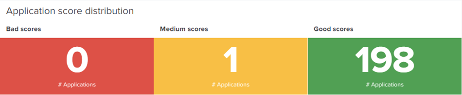
Application Scores
Application management departments are happy to use our Application Scores dashboard. They can see already in the dashboard’s first row how their apps fare and where action might be required.
Below the first row, the dashboard visualizes scores for important KPIs like input delay, app errors, or network latency for all your applications in addition to standard metrics like CPU, RAM, and Disk IO.
Scrolling further down after analyzing the component scores, you can find statistics about the ten worst applications in terms of resource consumption. With that information, you can already tell which applications your users may not like to work with.
Some applications may work better on newer or better-equipped hardware models. Hence, the dashboard displays a data table showing you all hardware models apps were seen running on. If you prefer to group differently, uberAgent offers several additional grouping options. Discover how your applications perform in a specific group by clicking on a group of interest. The grouped application scores are displayed in a drilldown table below. To discover more about a specific application, click on its row, and Splunk takes you to the Single Application Performance dashboard, which we already know from the previous blog post.
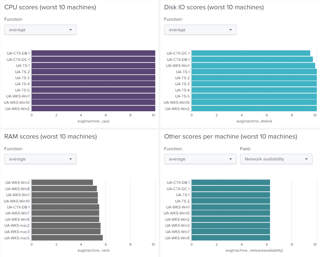
Machine Scores
Infrastructure teams are often just interested in how “their” machines are doing, and if the assigned resources are sufficient. They don’t want to be bothered with information like logon durations or application startup times if the underlying hardware is doing well. Providing your infrastructure team with the Machine Scores dashboard will give them exactly what they need: a general overview of how the entire fleet is doing – just like the Experience Score Overview but from a machine-focused perspective.
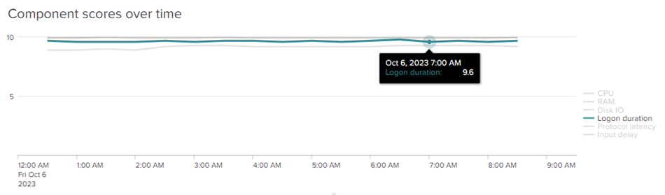
As in the Application Scores dashboard, the Machine Scores entry point is a panel to show how scores are distributed across the infrastructure. Below that, the dashboard highlights how the component scores for your machines have changed.
Get a sense of the worst ten machines when looking at scores for CPU, RAM, Disk IO, or metrics such as network availability:
After scrolling through the charts, the dashboard provides a table displaying the performance statistics for your entire estate. This table is grouped by hardware model by default. Clicking on a row of interest reveals which machines are part of the respective group.
When you click a specific device, Splunk takes you to our Single Machine Detail dashboard to go into detail about that particular machine. At this point, you may notice how similar the three score dashboards are – just focused on the specific category.
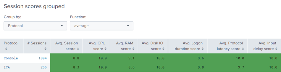
Session Scores
The Session Scores dashboard lets your VDI team know precisely how user sessions are doing in the environment. Similar to the Machine Scores and Application Scores dashboards, the Session Scores dashboard shows the score distribution and how the corresponding component scores have changed over time. This means you can analyze the change in scores for KPIs such as Logon Time, Protocol Latency, and Input Delay, as well as the standard CPU, RAM, and Disk IO metrics. A historical graph helps you to determine how infrastructure changes affected the quality of your user sessions.
In the data table at the bottom of the dashboard, you can compare the scores between different remoting protocols – or between remote and local use (“Console”). Again, other grouping and comparison options are available.
When a protocol’s row is selected, you’re presented with a data table listing all sessions established using that protocol. When you click a particular session, Splunk takes you to the Analyze Data Over Time dashboard that we also learned about in the previous blog post of the series.
Turn Your Research Into In-depth Analysis
Each score dashboard sheds light on how those components of your IT environment are doing that are relevant to the dashboard’s category (e.g., applications). Scores range from zero to ten; they are visualized with the color system we know from the Experience Score Overview. Finding out about bad scores for a particular component in a specific category enables your team to start investigating with uberAgent’s more detailed dashboards. Based on what you’ve found, you’re guided to where to start your in-depth analysis.
Suppose you’ve identified a low score for logon duration in the category user sessions. This means that the user logon duration is bad, potentially frustrating your users.
To get a sense of how long people are actually spending their time waiting for the login to complete, check out the User Logon Duration dashboard.
Gain Security Insights for Your Helpdesk
We’ve covered a few ways to utilize uberAgent UXM in a helpdesk environment to measure user experience. The Experience Score Overview dashboard is a great starting point for looking at your entire IT infrastructure. The individual score dashboards we discussed in this article also provide the same kind of overview, but each from a specific perspective.
The user, application, and machine score dashboards are similar in structure. You start with statistics, and as you drill down, you get more and more detail. Finally, you’re offered the ability to drill down even further to analyze a machine, user session, or application in detail.
However, your helpdesk team may also be interested in understanding whether everything is running securely and if configurations are compliant with your security policy. With uberAgent 7.1, we introduced a dashboard that combines ESA’s two primary data sources, the Security & Compliance Inventory and the Threat Detection Engine. The next article in this blog series will explain the counterpart to the Experience Score Overview in uberAgent ESA – our Security Score dashboard.
About uberAgent
The uberAgent product family offers innovative digital employee experience monitoring and endpoint security analytics for Windows and macOS.
uberAgent UXM highlights include detailed information about boot and logon duration, application unresponsiveness detection, network reliability drill-downs, process startup duration, application usage metering, browser performance, web app metrics, and Citrix insights. All these varied aspects of system performance and reliability are smartly brought together in the Experience Score dashboard.
uberAgent ESA excels with a sophisticated Threat Detection Engine, endpoint security & compliance rating, the uAQL query language, detection of risky activity, DNS query monitoring, hash calculation, registry monitoring, and Authenticode signature verification. uberAgent ESA comes with Sysmon and Sigma rule converters, a graphical rule editor, and uses a simple yet powerful query language instead of XML.
About vast limits
vast limits GmbH is the company behind uberAgent, the innovative digital employee experience monitoring and endpoint security analytics product. vast limits’ customer list includes organizations from industries like finance, healthcare, professional services, and education, ranging from medium-sized businesses to global enterprises. vast limits’ network of qualified solution partners ensures best-in-class service and support anywhere in the world.


