Visualizing uberAgent Data in Azure Monitor—Part 2: AM vs. Splunk
Welcome back to our four-part blog series about visualizing uberAgent data in Azure Monitor. In the first part, you learned the basics about Azure Monitor and the search language Kusto. You created your first Kusto search as well. This here is part two.
The blog-series is split as follows:
- First part: the basics
- Second part (this article): comparing the dashboarding capabilities of Azure Monitor and Splunk
- Azure Dashboards
- Azure Monitor Views
- Workbooks
- PowerBI
- Third part: using Grafana with Azure Monitor for uberAgent
- Fourth part: conclusion
Dashboard Requirements
Most backend platforms have visualization components. But we don’t just need “dashboards” for uberAgent. We need a powerful frontend that combines great UX with the ability to visualize billions of events from hundreds of thousands of endpoints.
Azure Monitor (AM) has, in fact, four different dashboarding technologies. Before moving on and elaborating on AM’s capabilities, we’ll define our requirements.
Interactivity
uberAgent collects so much information, it would be overwhelming to see all of it on one page. Hence users should start on an overview page and should then be able to select items like machine or user names to drill down to more tailored views. These detailed views should open in new dashboards or, better yet, in new rows on the existing dashboard (see the animation above).
Filtering
Typically, uberAgent customers have thousands of machines, users, and applications. It is not always useful to see all the assets. Sometimes you only want to look at a subset, like:
- machines from a certain vendor
- desktops with Windows 10
- specific applications
Therefore, a sophisticated filtering mechanism is needed. To give just one example of the many little things we do in our Splunk dashboards: we add or remove filter fields depending on the data shown on the dashboard. A Citrix dashboard, for instance, has other fields to filter by than a GPU dashboard.
Powerful Charts
This sounds obvious, but the charts should be good looking. It should also be possible to place wherever they are needed on the page. Charts should be customizable in terms of color and appearance.
Not every metric should be visualized in a pie chart (actually, none should). Hence we need different chart types and visualizations to choose from.
Variables And Parameters
This requirement is already partly included in the previous points but it is so important that we list it separately. We use variables in Splunk dashboards a lot. We use them per dashboard, per row, per panel, and even per chart. Variables help us to avoid writing redundant code. They also add flexibility to dashboards etc. by letting you choose between a variety of aggregation functions per chart.
Parameters are the secret sauce for flexible dashboards. Take our network communication dashboard as an example. We have variants for machines, applications, and processes. Behind the scenes, though, there is just one dashboard that gets called with different parameters.
Packaging as an App
uberAgent ships with more than 60 Splunk dashboards. Installing the dashboards and their related files should be quick and easy for the customer. That requires some kind of app concept built into the platform.
JavaScript Support
Last but not least: JavaScript. Not everything you see in our Splunk dashboards is available out of the box. However, Splunk comes with a JavaScript framework which we make use of to create what we’re missing. We definitely want that for other backends, too.
Comparing Azure Monitor With Splunk
AM has four visualization options. All four are described by Microsoft with the pros and cons in this article. I recommend working through it before continuing here.
Let’s compare each Azure Monitor dashboarding option with Splunk, based on the requirements laid out above.
Azure Dashboards
Azure Dashboards is probably the easiest way of visualizing data from Azure Monitor Logs. One can save charts powered by Kusto searches on new or existing dashboards with a few clicks. Azure Dashboards are great to get an overview of your environment. The dashboards are static, though. It is not possible to drill down by clicking on a chart.
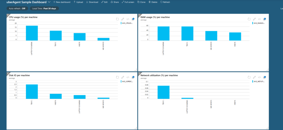
A simple visualization of uberAgent data built with Azure Dashboards
Capabilities
- Interactivity
- Drill down to new dashboard: no
- Drill down on the same dashboard: no
- Filtering
- No
- Powerful charts
- Good looking: charts are not pretty but good enough
- Resizeable and rearrangeable: yes
- Customizable: no (source)
- Different chart types: quite okay. Bar charts are missing (only column charts are available).
- Variables and parameters
- Only for AM Metrics, not for AM Logs. uberAgent requires the latter.
- Packaging as an app
- Dashboards can be exported, but not packaged as an app
- JavaScript support
- No
Azure Monitor Views
While still accessible in the Azure portal, Azure Monitor Views will be replaced by Workbooks. It makes no sense to rely on outdated technologies, so we will not look at Views any further.
Workbooks
Workbooks are already great and Microsoft is constantly adding new features and enhancements. Here is a short list of its capabilities:
- Supports both logs and metrics
- Allows both personal and shared views
- Custom layout options with tabs, sizing, and scaling controls
- Support for querying across multiple workspaces, Application Insights applications, and subscriptions
- Enables custom parameters that dynamically update associated charts and visualizations
- Template gallery support from public GitHub
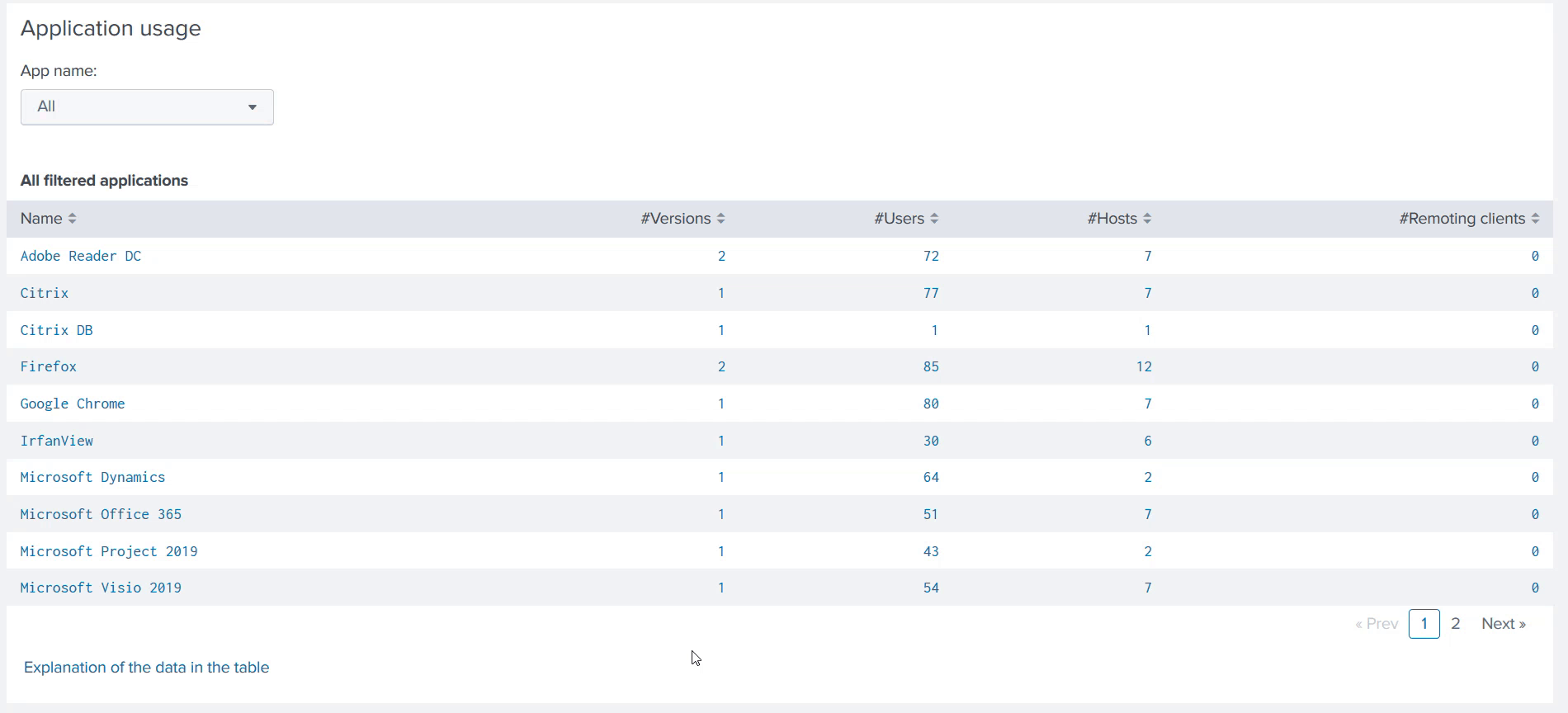
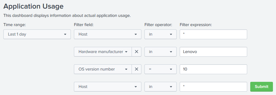
I tried to recreate uberAgent’s Machine Performance dashboard in a Workbook and got great results:
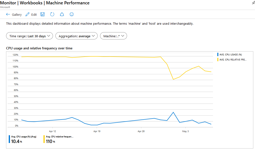
Azure Monitor Workbook dashboard example with filtering and parameters
Capabilities
Let’s check the details:
- Interactivity
- Drill down to new dashboard: no
- Drill down on the same dashboard: yes
- Filtering
- Yes, through parameters
- Workbooks can’t provide the same level of filtering as Splunk because AM is missing some advanced Splunk features.
- Powerful charts
- Good looking: yes
- Resizeable and rearrangeable: yes
- Customizable: somewhat; you can choose between color sets (source)
- Different charts: yes
- Variables and parameters
- Yes (source)
- Parameters are only possible per Workbook or group. In Splunk we have parameters per chart.
- Packaging as an app
- Only via Resource Manager templates (source)
- JavaScript support
- No
Microsoft states that Workbooks do not have a dense layout like dashboards, which make workbooks less useful as a single pane of glass. Intended more for providing deeper insights. (source). So a combination of Azure Dashboards and Workbooks would be nice. Too bad that Azure Dashboards are not interactive.
PowerBI
We can shorten things here. Queries have to be written in Kusto in Azure, exported to a PowerBI script, and then imported into PowerBI. That process is far too cumbersome to bother our customers with it (we’re selling a UX monitoring product, after all).
Conclusion
Unfortunately, none of the built-in visualization options can compete with what Splunk has to offer. Azure Dashboards are not interactive. Azure Monitor Views will be replaced. While PowerBI is powerful, it’s a mess when used in combination with AM.
Workbooks is the best built-in option at the moment. If you try to recreate Splunk Dashboards in AM Workbooks, you’ll be able to achieve some success, but ultimately fail because of many missing details.
To Be Continued…
If you have read the article from Microsoft about the visualization options that I mentioned earlier, you already know about Grafana—a third-party visualization solution. In the next article in this series, I will explain in detail what Grafana is, how to install and configure it, how to integrate it with Azure Monitor and uberAgent, and how to create a dashboard.
Update 2023-01-23
Nearly three years after we wrote that blog post, we don’t see Azure Dashboards or Workbooks evolving as we’d like. The only change we found, for Azure Dashboards, is the ability to use parameters for Azure Monitor logs, too. The feature was only available for Metrics before.
About uberAgent
The uberAgent product family offers innovative digital employee experience monitoring and endpoint security analytics for Windows and macOS.
uberAgent UXM highlights include detailed information about boot and logon duration, application unresponsiveness detection, network reliability drill-downs, process startup duration, application usage metering, browser performance, web app metrics, and Citrix insights. All these varied aspects of system performance and reliability are smartly brought together in the Experience Score dashboard.
uberAgent ESA excels with a sophisticated Threat Detection Engine, endpoint security & compliance rating, the uAQL query language, detection of risky activity, DNS query monitoring, hash calculation, registry monitoring, and Authenticode signature verification. uberAgent ESA comes with Sysmon and Sigma rule converters, a graphical rule editor, and uses a simple yet powerful query language instead of XML.
About vast limits
vast limits GmbH is the company behind uberAgent, the innovative digital employee experience monitoring and endpoint security analytics product. vast limits’ customer list includes organizations from industries like finance, healthcare, professional services, and education, ranging from medium-sized businesses to global enterprises. vast limits’ network of qualified solution partners ensures best-in-class service and support anywhere in the world.


